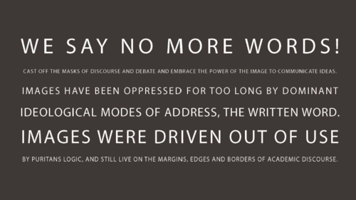
On 3/11/11, I attended the Illustration as Writing: Visual Language Symposium at MMU. It was the second event held by the Illustration Research Team, led by Desdemona McCannon. They are keen to increase the amount of research being undertaken about illustration, as there is not enough good critical writing on the subject. The event was introduced by Desdemona, Chris Glynn and Amelia Johnstone (UWIC). They read a manifesto against using words alone to communicate idea, “ We dispute the subservience of images to text.” They declared – illustration is a way of writing not pure decoration.
They hope that the papers presented would be submitted to the ‘Journal of Writing for Creative Practice’, and would generate more debate about our discipline.
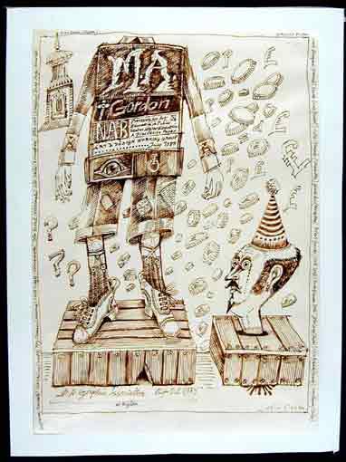
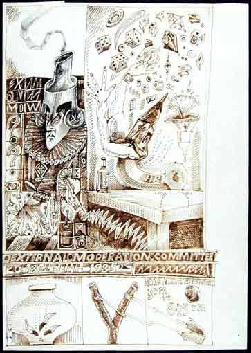
Chris Glynn asked the audience to not only write during the presentations but be free to doodle any visual images that came to mind. He is compiling a series of ‘Drawings from Meetings’ as John Vernon Lord has done since 1961 as a tutor in Illustration at Brighton. These drawings help his mind to concentrate and make sense of what is being discussed.

1. Image Texts
Dr Sheena Calvert – Materia Prima: Text as Image
As a typographer Sheena has become interested in the relationship between material language (Materia Prima = the primary base of language) and various philosophies of language. She used the example of “This sentence is a lie.” This is a paradox and is both true and false at the same time.
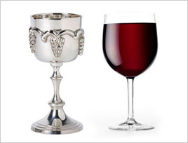
She referenced The Crystal Goblet by Beatrice Warde who gives a beautiful metaphor of the selection of a perfect wine-glass as having a parallel with typography. Text should invisible to the content. (see Richard Shusterman: Surface and Depth and Giorgio Agamben for further reading). This was illustrated in the examples of Hellenic Pattern Poetry, where the text starts to become image.

Poets such as E.E Cummings use the visual presentation of words to support the text and aid communication. The pauses, punctuation, severe use of serif all help with the viewers understanding. In this sense, the language is performed and the visual display of words is taken advantage of. William Burroughs made inventive poetry for Rhinoceros magazine.
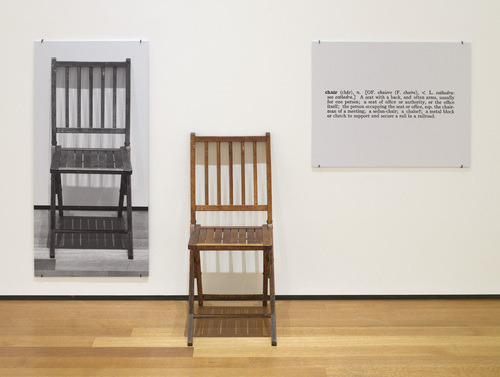
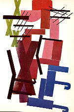
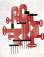
The work One and Three Chairs by Joseph Kosuth can be seen to highlight the relation between language, picture and referent. Artists such as Kurt Schwitters and H.N Werkmann have played with breaking boundaries between image / text and meaning. Werkmann worked directly with letterforms on a press. Text here is used as a carrier of ideas and reveals language in a highly playful way.

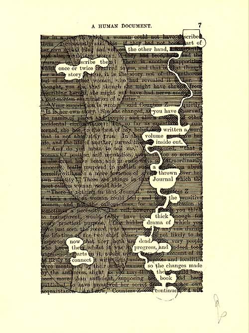
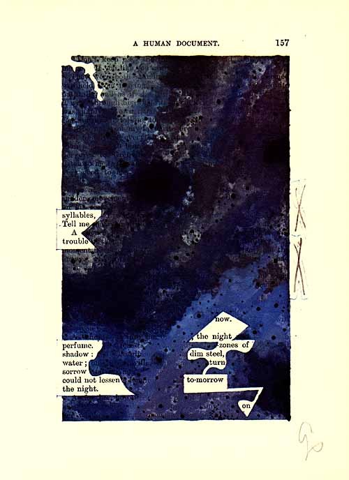
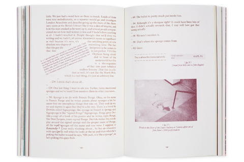
The artist Tom Phillips finds new narrative lurking within A Human Document (1892) by W.H. Mallock.

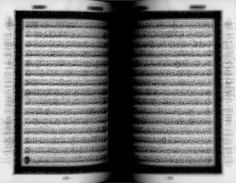
Idris Kahn has overprinted the Holy Quran onto one page. It is not obvious when we first see it but meaning is attached if we look deeper.
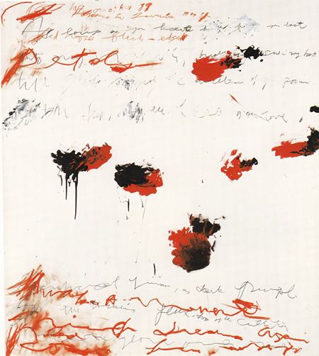
Sheena’s own work involves the production of experimental typography and prints made using a traditional letterpress. She loves this medium as the letters can show histories of their past, where there are indentations made in the shapes. The outcomes an also be unpredictable. She has a problem with philosophy about ‘meaning’ as it does not allow for language to be seen as play. Diagrams and logical ways of displaying information are functional but are not experiential. It is said that, Cy Twombly's paintings bear a resemble to writing. According to Sheena they are they aligned with material prima. They hold meaning in the rawness in the use of materials. His words are not readable yet are loaded with meaning.
There is then no such thing as invisible language. Philosopher John Dewey says that alllanguage involves both what is said and how it is said: substance and form.
Desdemona McCannon (MMU)
Illustration and Gnosis (or describing the unknowable).
The term ‘Gnosis’ was explained as relating to, or possessing intellectual or spiritual knowledge.
The presentation began with a quote from Willem de Kooning
“I paint the way I do because I can keep on putting more and more things in…”
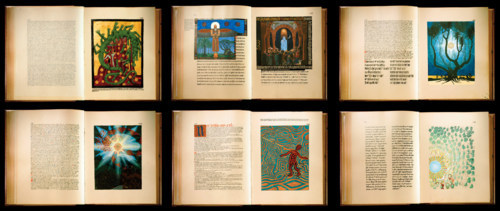
The publication of ‘The Red Book’ by Carl Jung, shows a collection of writings and drawings of dreams and the unconscious. Jung began The Red Book after breaking from his work with Freud. It remained unpublished for many years as he thought it would undermine the authority of his academic status. It is a 205-page Medival-style Manuscript. The text is juxtaposed alongside wild drawings. The content is said to be highly personal. Do the images make greater sense of the text? The images offer pauses to the text.
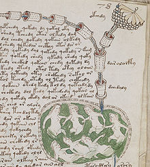
Examples were shown from The Voynich manuscript, described as "the world's most mysterious manuscript," it dates back to the early 15th century. The images, which appear amongst the text, are carriers of meaning, yet the original meaning has vanished. For this reason they are very curious. There are women and plants depicted, but what are they doing? What does it mean? Is it about the really world or purely imaginative? Many people have tried to offer an interpretation of the images but no-one can really decode them without knowing their purpose or context.



In mystical poetry the reader is left disorientated, the foreground and background of the text have merged, obscured or changed. It has become more about the aesthetic. There is an attempt in the illustrations for William Blake’s ‘The Marriage of Heaven and Hell’ to try to synthesize text and image.
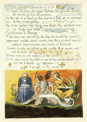
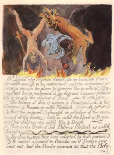
In Roland Barthes concept of semiotics, he identifies the term ‘anchorage’ - the text somehow "anchors" the meaning of the image. Desdemona thought that somehow we felt compelled to anchor text and meaning in order for it to not drift away. Could be more meditative in our approach?
In these Shaker Gift Drawings, the text and image are not coherent. It flips our modes of thinking. We are left feeling baffled. It is, too secret and removed from ordinary experience. We want to make meaning out of it.
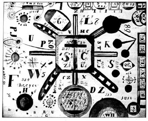

The morning sessions was brought to a close by questions from the audience. The main themes re-visited were that non-verbal thinking should be highly valued. Images such as the ones highlighted are as intelligent as academic writing. We are constantly making meaning and it shifts over time. While semiotics is a useful tool to decode meaning, it is very pinned down and almost like a science. A real weakness of illustration in current practice is that it simply mimics the text. This is because it is commercially led. There is a pressure to illuminate. We should seek to challenge meaning through our image making. The illustrator can live in the interplay between text and image.
2. Authority
Catrin Morgan (RCA) - Phantom Settlements

This is a book created by Catrin Morgan in which she questions issues of truth, deception and authenticity in art. The book is broken into chapters and follows 3 artists: Ryan Gander – an artist who likes to tell tale tales and tracks where his rumours end up, Jamie Shovlin – who created a hoax using drawing of a missing school girl – who later it was found was a anagram of his name and Tom McCarthy a writer and conceptual artist who makes all of his work based on the themes of repetition and duplication.
At first it was unclear whether Catrin is giving genuine facts about the interviews she had with these artists or if she is inventing it all. I realised part way through the conversation that Catrin was repeating what she had previously said but she changes the way in which she says it, some is factual, some vague etc. The linguistic style of the text is echoed by the way the image are rendered and did infact help my mind to make the connection. The first chapter has hand-rendered images made to look like a graphic novel, the same images are shown in chapter two but this time, they are all reversed, then they are faded grainy pictures, then fragments / close-up of details. The final chapter has photo realistic drawings. Catrin enjoys letting her work muddy the water a little. She is interested in that way the image can have the power to on some way alter the perception of the text. Are some of the styles used more authentic than others? Does the audience trust in some more than others? Can the image express something beyond the words? These are the questions that drive her work. She likes to make books as they don’t change, they are an un-altertable object (unlike the internet).

Jonathon Gibb (Edinburgh College of Art)
Visions of the Beast: Animal imagery in Illustration
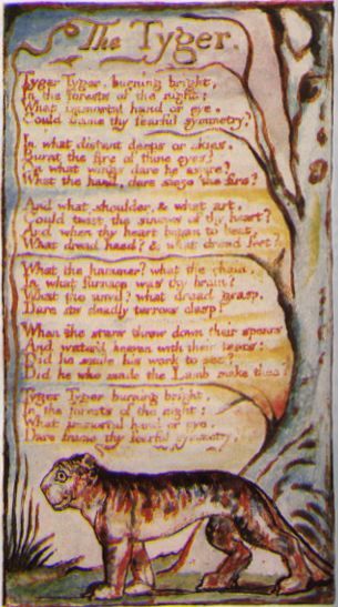
There has always been writing and drawing about animals. William Blake’s beautiful poem ‘The Tyger’ (1794), conjures up visual images immediately.
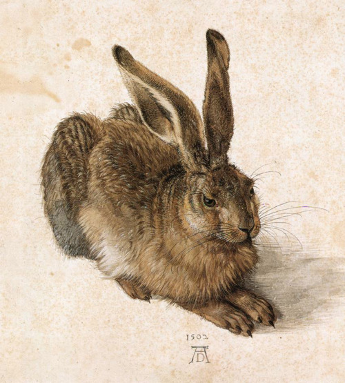
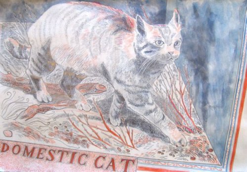
In Durer’s drawing ‘The Young Hare’ (1520), the hare is poised yet static, fixed in time yet timeless. This idea is also captured in Emily Sutton’s ( a graduate of his) image of ‘The Domestic Cat’. Jonathon wonders how we are able to see and understand words about these animals and make pictures?
There is an infinite number of images online (especially drawings of animals – he mentioned that if he saw another bear or owl in a portfolio, he will scream!) and they are both useful and useless in developing ones’ own personal visual language.
He encourages his students to not fish from the same pool (online) and follow the trends but to draw, draw, draw. They hone their way of working through primary research in looking, drawing and observing. The cat that Emily Sutton drew was actually a stuffed cat at a museum. She was able to breathe life into it via drawing.
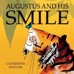
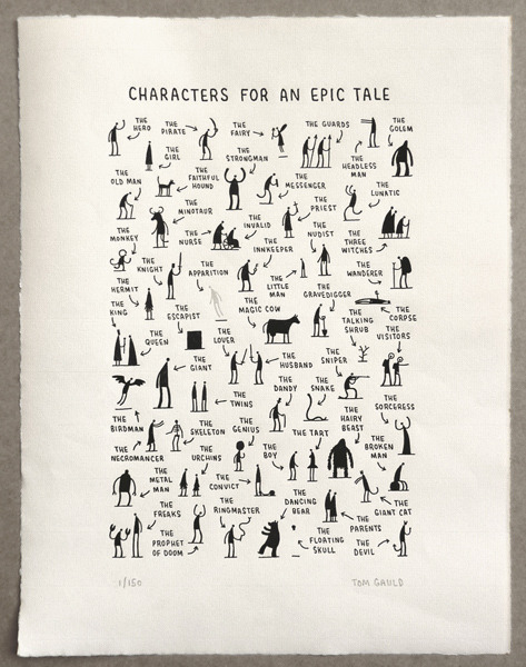
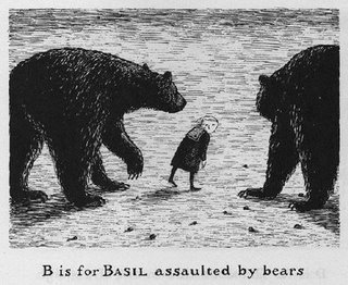
An ex-student Catherine Rayner, wrote and illustrated a book for children called “Augustus and his Smile” – she worked closely with animals at Edinburgh Zoo. Tom Gauld as a student, made lots of drawings at a vetinary school. He really understands form and studied the work of Edward Gorey.
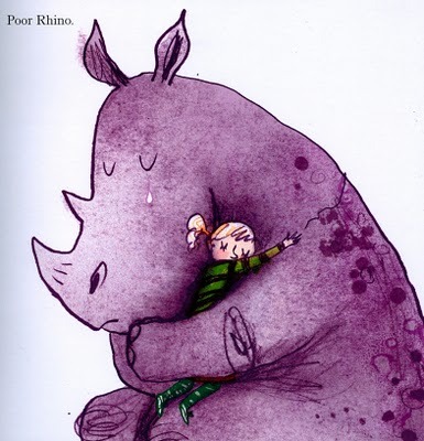
A sensitive understanding between human and animals is made in the pictures by Sara Ogilvie in ‘Rhinos don’t Eat Pancakes’, this has similar feel to the childrens’ classic (and my favourite!) ‘The Tiger Who came to Tea’. The ability to be able to be a both writer and an illustrator is a real skill.
Jez Burrows and Lizzy Stewart have a publication called “We are the Friction”. It’s a series of ten short stories and illustrations. Half of the stories were written by Jez inspired by Lizzy’s artwork and the other half is Lizzy’s artwork inspired by Jez’s stories. This is a lovely idea and features a giant wolf!
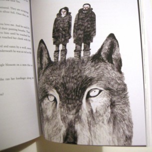
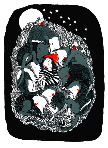
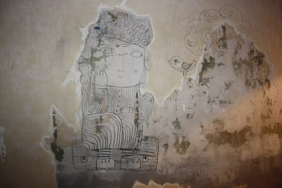
Mina Braun is by folk and fairy tales, trees and animals and the relationship between humans and nature. This is a theme for many a picture especially as animals take onhuman characteristics (anthropomorphism). She seems to find animals where ever she goes!
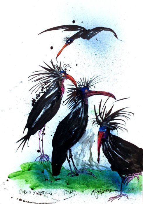
An exhibition running this month in London, entitled The Ghosts of Gone Birds, shows images of 300 extinct birds created by artists including Jamie Hewlett, Ben Newman, Sir Peter Blake, Ralph Steadman, Margaret Atwood, Rob Ryan, Kai & Sunny, Le Gun. I heard Ralph Steadman discussing in on Radio 4 last week. Birds celebrated in the show include the Dodo, the Matinique Amazon Parrot, the Black Mamo and the Great Auk. I think this would be a wonderful project for Year 1 to invent their own extinct birds but it also shows how our love of drawing animals to be used to raise awareness about birds under threat currently.

Lots more to post will write more later!

No comments:
Post a Comment