


Meeting lovely tutors from Sheffield Hallam University (Lee Ford).
I attended the VaroomLab IllustrationSymposium last week (18th & 19th Sept) at Arts
University Bournemouth. This event explored
notions of interpretation, reinterpretation and misinterpretation within
illustration practice. As described in the in the blurb as ‘A host of speakers
investigated and celebrated the potential, the creative strategies and the
possibilities for practitioners to move minds, challenge norms and influence
the ways in which we see the world and connect with it.’
MARCUS OAKLEY


Images from: http://marcusoakley.blogspot.co.uk
The first keynote speaker was Marcus Oakley, who explored the connection between Illustration, Art & Design. He
talked through his influences from figurative, object based or abstract art. He
constantly questioned where his own work fit in this landscape as he could see connections
to it all. He asked if Folk Art was a kind of Illustration – it was made for a
purpose, with examples of The Lewis Chessman (AD 1150-1200) and the dishes of Thomas Toft (see below).


The links between the Graphic Arts
and Illustration were illustrated visually, with references to the work of
Hogarth, Julian Opie, Jockum Nordström, Philip Guston, Lou Loebers’ ‘avant-garde’
Children’s book, Keith Harring and David Shrigley. He had noted that that when ‘design
work’ was made by an artist, if often appeared clumsy as ‘communication’ is often
missed and the result becomes a matter of personal interpretation by the artist,
as shown in the examples of the Olympic Posters 2012 by Howard Hodgkin.


He then asked many of his illustrator friends to answer the question about whether they thought their work was 'art'. There was a mixed response but the concenus was that illustration was commercial art with many illustrators not really having a choice about being an illustrator, they simply 'need' to make pictures. The picture is the most common means of communication. It was great to hear Marcus, ask these questions about his own work, he had a broad range of points of reference. This talk would have been good for any student of illustration to hear.
CHRIS CAMPE
Chris Campe delivered a paper called ‘Girls
Go First?’ Negotiating Gender Representation in Contemporary Illustration,
(also noted as the only female speaker of the day!). She gave a case study of
work by the German Illustrator, Stephanie Wunderlich, who had made an image for
a newspaper about the roles of family members at Christmas time. She had
portrayed a scene with a female figure stirring a pot, with a male figure on a
ladder decorating the tree. She was asked by the art director to switch the
roles of the 2 main characters. The final artwork saw the male as the cook, in
charge of the food, he playfully sprinkles herbs into he food and has a glass
of wine in his hand. The woman is on the ladder. The work in effect, shaped by
the client, who chose to represent the gender roles in a different way.
Referred to as ‘the dominant fiction’, by Kaja
Silverman (1966), ‘a dominant fiction’ is reserve of images and a manipulator
of stories, its purpose is to give members of a social structure, a consensus
in how they identify themselves. In the case of gender in illustration, the
viewer connects with images and relates it to what they have seen before. The
question to be asked is ‘ Is this image a realistic depiction of the world?’
and ‘Whose perspective does it represent?’ How do illustrators and their client
negotiate the reality? An illustrator is able to alter reality, leave out the
details, highlight, emphasize, dramatize and focus.

Image by Stephanie Wunderlich
In another example the male and female roles of
children had been switched to show the girl as less dependent than the boy.
This gave odd little visuals, as it appeared that the boy was chasing the girl
or trying to touch her in inappropriate ways. It is not always easy to simply
reverse the roles. In both cases surprisingly, it was the illustrator who
depicted the conventional stereotypical roles of gender, the client asked them
to change it, highlighting that the issue of gender is a ‘shared effort’ for
all involved in making and commissioning illustration.
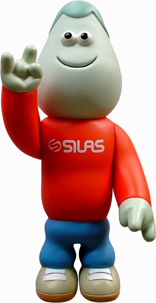
James Jarvis


James Jarvis
Interestingly, I saw James speak when I was
a student, about 12 years ago. It was in the midst of his work really taking
off with vinyl toys and comics amongst many other avenues were being produced.
In the last few years, James has revisited his own degree work, to try to
connect with what he did before his career went into overdrive. He made
drawings of the Southbank in 1993 and on reflection, loved the freshness and
energy of this work.
http://www.studiojarvis.com/car_parks.html
When he studied Illustration at Brighton,
the only way for illustrators to get work, was to wait to be commissioned for ‘The
Radio Times’, Royal Mail stamps and if you really made it ‘The Spectator’. The
fresh illustrators of this time, started to find new avenues for their work,
driven by their own interests, such as skateboarding, music etc. James fed
himself on the cultural references of the time, many of which appeared in his
work – sometimes irrelevant to the brief, but filling images with stuff he loved,
music posters, computer games and trainers. His clients included The Face and Slam City Skates in London.

The Face: magazine illustration
The popularity and demand of his work, was so great that he formed his own company called 'Amos' in partnership with Russell Waterman, they made toys, T-shirts and even curated a music festival. This meant that he wasn't waiting to be commissioned and was in effect commissioning himself to make the work he wanted. He bought into the generation that wanted merchandise and to consume. A point came when he realised he was repeating himself and not learning anything new anymore. He was tired of making work that was about a 'look' and not ideas. He was selling himself for other brands like MTV, NIKE and Coca-Cola to buy into.

He admired practitioners like Paris based artist Monsieur Andre, whose output was very board as he works in a very multidisciplinary way. He started to evaluate his own work and make pictures based on ideas. He devised a character that could ask questions about the world and respond to ideas about philosophy, the intellectual process and the content became far more important. He worries what his audience would make of his new work and has used instagram to share drawings. In a sense he has repacked his work to make something new, the new character has created a way to unify his work and has become the 'new me'.

http://sphericdialogues.wordpress.com


ERROR
There were then, 4 x 20 minute presentations about the theme of ‘Error’. First up was ‘The interpretation of error: Glitch, craft and illustration’, by staff from AUB, Joel Lardner and Paul Roberts. The ‘Glitch’ aesthetic is currently fashionable. The word itself refers ‘a malfunction in hardware or software’. When applied to practice, it can create a break from the expected results. Work by designers like David O’Reilly and Gero Doll, features such as brightly coloured, highly stylized, pixelated or mis-registered. French cultural theorist, Paul Virilio said that 'While the human gaze becomes more and more fixed, losing some of its natural speed and sensitivity, photographic shots, on the contrary, become even faster' - is this feeding our desire for this aesthetic?
There were then, 4 x 20 minute presentations about the theme of ‘Error’. First up was ‘The interpretation of error: Glitch, craft and illustration’, by staff from AUB, Joel Lardner and Paul Roberts. The ‘Glitch’ aesthetic is currently fashionable. The word itself refers ‘a malfunction in hardware or software’. When applied to practice, it can create a break from the expected results. Work by designers like David O’Reilly and Gero Doll, features such as brightly coloured, highly stylized, pixelated or mis-registered. French cultural theorist, Paul Virilio said that 'While the human gaze becomes more and more fixed, losing some of its natural speed and sensitivity, photographic shots, on the contrary, become even faster' - is this feeding our desire for this aesthetic?
RGB XYZ A boy finds adventure in the big city
Written & Directed by David OReilly
Gero Doll

Designers are not hiding the joins in their work,
the traces of the digital are evident. See Jonny Clapham. Furniture designer, Ferruccio Lavia, makes objects with the ‘glitches’ in
tact. The visual style is being used in illustration, design, textiles, music videos, Rosa Menkman was refered to a number of times as
she has writtena text called ‘The Glitch Momentum’. She distinguished 3 types
of glitch:
1) Pure Glitch – accidental or unintended.
2) Instigated Glitch – artistic intervention (e.g
rewriting codes, opening an image in different software etc).
3) Commodified
Glitch – a surface level, an aesthetic which has been absorbed into culture,
then maybe becomes commodified as a filter or app.
There is a certainty in making work digitally, it is very controlled in a sense (especially with the use of graphic tablets). There is a return to work where it does not look so sanitised. Illustrators need to take control of the digital platforms and allow the 'glitch attitude' break from expectations as a creative force, allow for chance, risk and making mistakes.
 Martin O'Neill: The Sunday Observer - Fiction supplement

There is a certainty in making work digitally, it is very controlled in a sense (especially with the use of graphic tablets). There is a return to work where it does not look so sanitised. Illustrators need to take control of the digital platforms and allow the 'glitch attitude' break from expectations as a creative force, allow for chance, risk and making mistakes.
‘Make Room for Error’
Paul Burgess again
advocated the need for working with mistakes and embracing the things that go
wrong. There is a beauty in error. This is summed up by this quote by Scott
Adams, “Creativity I allowing yourself to make mistakes. Art is knowing which
ones to keep”.
Getting things wrong is hard to accept. Websites
which, poke fun at ‘epic fails’ show how people enjoy mocking messing up.
Illustrators like David Foldvari are taking this way of working in new
directions, showing error, randomness and simple drawings in his animations,
allowing it to play like one experiment.
Martin O’Neill, has ‘error’ as a feature in
his work, which always keeps it fresh and surprising. He describes a collage as
‘one big mistake.’ He is keen not to repeat the mistakes, so that they become
an affectation. He seeks new ways to create mistakes. He cuts up finished work
and makes a new piece from it, he notices the magic when cut outs fall on top
of each other by chance. Errors, deviate from the norm, the creator
must see the door opening and seize the chance to work with it. They should
create opportunities for systems of chance and use it as a tool to generate new
exciting work.
http://www.andersenm.com
In design this can be the best way to make
work that still has life. Designer Martin Andersen always uses visual experiments
in his commercial work. The work of Michelle Thompson and Chris Bigg also show how imperfection is beautiful.
German based, Design studio 'Hort' (which means creative playground), encourages it's creatives to continuously experiment and play. Interns work with process, placing laptops on scanners and pouring oil down screens to video what happens. Materials are to be played with. See (film about Hort)
'She Lost Control'
Tom Barwick, lecturer on the Illustration Course at Plymouth University, opened with a quote from Josef Albers about something we advocate very much at Stockport College, referring to the truth to materials and that ‘in the beginning there us the material only’. Further reading from the, The Josef & Anni Albers Foundation, a text written by the Bauhaus in 1928 expands this ideas upon in terms of think a creative education.
(see full text: http://albersfoundation.org/teaching/josef-albers/texts/)


In the 1870's Renoir said, “The more you rely on good tools the more boring your sculpture will be.” This can be aplllied to all the trickery we see being used today. There is enchantment and wonder in the unpredictable.
For this particular collection of greyscale patterns, Ferriss used code written in the popular programming language Processing that employed two techniques: pixel sorting and cellular automata. Starting with a photograph of a wave crashing against a craggy shore, Ferriss first used code to sort the pixels from brightest to darkest (his program was a tweaked version of one written by fellow artist Jeff Thompson). Then Ferriss made a greyscale version of that image and sorted its pixels again. At this point in the process, the original ocean scene is totally unrecognizable, having been rearranged pixel by pixel into a bouquet of monochrome diamonds. via everlan
Other 'error' based practitioners, would include the wonderful Ralph Steadman, children's book illustrator Charlotte Voake and A, R. Penk. LA based artist Adam Ferriss, uses code to re-sort peels and creates and intervention with the images (see image above). A short film called 'A Case of Happy Accidents', shows Ian Pollock in the creative state of making work, Ian explains "You've got to play tricks, trip yourself up." Watch HERE.
Computers are 'thoughtless', when the illustrator steps away they can't think for themselves. The link was made between creating molton bronze. Tom demonstrated this by using the 'content aware' tool in Photoshop, to remove parts of a picture, by patch matching. This is being used by designers to play with and create new work. See: http://contentawaretypography.tumblr.com
Tom then demonstrated how he used this in his own work. He showed a pencil drawing that he had used this tool on to create a new and altered image. He also uses 'Mapping' in After Effects to trace an image over time (film) and take frames of the process. A morphing effect is achieve. There are questions about authorship in these processes he feels, 'who made it?'.

Sanza Stark from Game of Thrones: Content Aware Filter.
Digitally Processed Drawings for Agatha by Anton Chekhov
'Erodite'
Andrew Kulman, lecturer
and Illustrator from Birmingham City University, showed the Penrose Tribar
(1934). It is an impossible triangle, like the work of MC Esher, there is visual
trickery employed to confuse.
We all have different experiences of reality. The famous image by Magritte 'This is not a pipe', refers to the depiction of a drawing of a pipe portrayed as real. The title of the painting is 'The Treachery of Images' (1928). It is an illusion, a paradox. Magritte used silhouette, absence, ambiguity and illusion in his work. The image 'The Empire of the Light' is all wrong the sky is too luminous. A stick in water looks bent but the reality is about 'light'.
René Magritte 'The Treachery of Images' 1928
Rene Magritte 'The Empire of the Light' 1953-54
On the well-known Varoom cover, illustrator George Hardie, showed his love of solving and creating problems. As a massive collector, he always has personal narratives running through his work. If you look at this images form beginning to end, each image is connected from one to the next. He sets himself rules as well as following the rules of the client, production and the deadline. Read this article from Eye Magazine about his work. Guy Billout, plays with the viewers mind, his image 'The Key' asks the viewer to believe the impossible.
George Hardie: Varoom Cover
Guy Billout: The Key
A panel discussion then rounded up the day of talks, with comments made my both the speakers and the audience. it was clear that all who spoke, where interested in making sure that 'thinking' was part of visual language. Overally processed work, can all look the same. Haptic, chaos and glitch embraces being less and less concerned with the 'finished thing'. How this fits in with the client - commissioning role would be a question to think about? Working in analogue ways creates a pleasure as it can't be controlled. Working digitally has a lot of choice and the function to un-do work to easily. An participant directed everyone to an article by Florian Crammer called 'What is post digital?, he thinks that photoshop is a narrow path and that technology can now even define what a line should look like. An audience member questioned why we still publish editorials as still images and we have not yet really explored the potential of images transforming or changing over time.
No comments:
Post a Comment